
Introduction:
Users are using a variety of devices with different screen sizes and resolutions to access websites and applications due to the widespread usage of smartphones, tablets, laptops, and desktop computers. Responsive design is now crucial in this digital age to give users the best possible viewing experiences on all kinds of devices. This article examines the best practices for using responsive design to modify designs for a variety of devices.
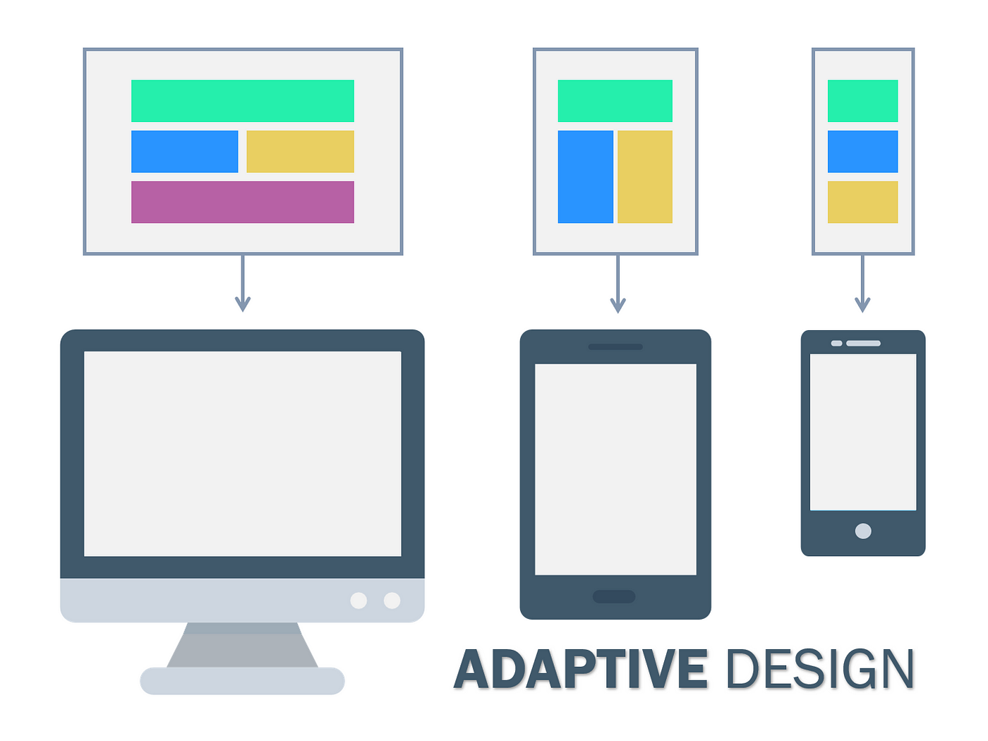
Comprehending Responsive Design Principles:

Responsive design is a web design methodology that endeavors to create websites and applications that offer the best possible viewing experience on various platforms, ranging from desktop computers to smartphones. Media queries, flexible images, and fluid grids are some of the fundamental ideas of responsive design. Fluid grids guarantee that items on the page adjust proportionately to the user’s screen size, and flexible images adapt to the available space without any noticeable resizing. Designers can use alternative stylesheets according to device properties like screen width and orientation by using media queries.
Prioritizing Content and User Experience:
It’s critical to give content and user experience top priority when modifying designs for a variety of devices. Make sure the most crucial features and content on your website or application are clearly visible and easily accessible across all platforms. Take into account how people will engage with your design in various contexts across various devices and adjust the user experience appropriately. Prioritize important content and optimize navigation for smaller screens because mobile users could have different demands and preferences than desktop users.
Developing Flexible Layouts:
Developing flexible layouts that can adjust to different screen sizes and orientations is a key component of responsive design. Using max-width and percentage-based widths, designers may make layouts that scale proportionately to the size of the user’s viewport. Steer clear of fixed-width layouts since they might not be able to handle a range of screen widths well. Instead, to make layouts that are responsive and adjustable across devices, combine media queries, flexible images, and fluid grids.
Optimizing Multimedia and Images:
Although multimedia and images are important components of web design, they also present difficulties for responsive design. Make sure multimedia and graphics are optimized for various devices to guarantee top performance and user experience. To guarantee that images occupy the available area without distortion, utilize responsive images that scale proportionately based on the user’s viewport size and think about using CSS techniques like background-size: cover. Use HTML5 elements with built-in responsiveness for multimedia material, such as audio and video, or use third-party solutions that facilitate responsive embedding.
Testing and Iterating:
To make sure your designs render correctly and perform as intended, thoroughly test them across a range of devices and screen sizes once you’ve incorporated responsive design strategies. Utilize real devices, browser development tools, and device emulators to mimic various viewing conditions and spot any problems or discrepancies. Get user and stakeholder feedback, then make iterative changes to your designs in response to their suggestions. Iteration and continuous testing are essential to improving your responsive designs and providing the best possible user experiences on all platforms.
Making Use of CSS Frameworks and Grid Systems:
These tools offer pre-made elements and layout structures that make the process of developing responsive designs easier. Designers may quickly create flexible layouts with established grid systems, typography styles, and UI elements by utilizing frameworks like Foundation or Bootstrap. These frameworks frequently include with best practices and responsive design patterns, which help designers produce visually appealing and consistent designs that operate on a variety of devices.

Putting Mobile-First Design into Practice:
This approach places more emphasis on creating for mobile devices than it does on scaling up for larger screens. Designers may make sure that crucial features and information are suited for smaller screens by beginning with a mobile-centric approach, after which they can gradually improve the design for larger devices. Designing for mobile first promotes performance, clarity, and simplicity, which improves user experiences across all platforms.
Designing with Flexbox and CSS Grid:
These two robust CSS layout modules make it simple for designers to produce responsive and flexible layouts. While CSS Grid enables more intricate two-dimensional layouts with rows and columns, Flexbox offers a more effective method of allocating space and aligning elements within a container.
Taking Performance Into Account:
Responsive design not only takes visual design into account, but it also optimizes performance for various devices and network scenarios. It is recommended that designers give priority to performance optimization strategies, such as optimizing code and assets for faster load times, limiting HTTP requests, and lazy loading images. Designers may make their designs more useable and accessible on a variety of devices and network connections by optimizing performance and cutting down on page load times.
Keeping Up with Emerging Trends and Technologies:
New methods, approaches, and technologies are continually being introduced in the subject of responsive design, which is a topic that is always changing. It’s important for designers to keep up with the most recent advancements in responsive design, including new browser features, CSS features, and design trends. Designers can remain ahead of the curve and produce cutting-edge responsive designs that satisfy the changing needs of users and devices by always learning about and adjusting to new trends and technology.

Performing User Testing and Feedback Sessions:
These procedures are crucial to guaranteeing that responsive designs satisfy users’ requirements and expectations on various devices. To find any usability problems or inconsistencies in the design, designers should test the usability of their work with actual users on a range of devices. By getting user input, designers may make wise decisions to enhance the user experience and learn important insights about how consumers engage with their designs.
Designing for Touch and Gesture Interaction:
Given the growing popularity of touch-enabled gadgets like tablets and smartphones, designers must to take touch and gesture interaction into account. Buttons, links, and navigation menus are examples of design elements that should be big enough to accept touch inputs and positioned properly to avoid unintentional tapping. Additionally, to improve the usability and interactivity of their designs, designers should think about implementing gesture-based interactions like pinching, tapping, and swiping.
Ensuring Inclusivity and Accessibility:
Inclusive design is crucial to guaranteeing that digital material can be efficiently accessed and interacted with by all users, including those who have disabilities. To guarantee that their designs are readable, usable, and comprehended by all users, designers should adhere to accessibility standards like the Web Content Accessibility Guidelines (WCAG). This entails employing semantic HTML code, offering alternate text for images, and making sure that text and background elements have the appropriate color contrast.
Optimizing for Search Engine Optimization (SEO):
Since search engines give preference to mobile-friendly websites in their search results, responsive design is essential to SEO. By employing best practices like using responsive pictures, using structured data markup, and reducing page load speeds, designers can make sure that their responsive designs are optimized for search engine optimization. Designers can increase their designs’ discoverability and visibility in search engine results pages (SERPs) by optimizing them for search engines.
Accepting Progressive Enhancement:
Progressive enhancement is a design methodology that prioritizes developing a strong base of essential elements before gradually adding more sophisticated features and improvements to the design. When creating a design, designers should begin with the simplest possible components, such HTML and CSS, and work their way up to more complex elements like multimedia and JavaScript. This guarantees that the design will always be readable and functional on all platforms and browsers, regardless of their specifications.
Working Together with Developers and Stakeholders:
To guarantee that responsive design is executed well and satisfies project goals, strong coordination between designers, developers, and stakeholders is necessary. In order to ensure that a design is responsive and usable across a range of devices and screen sizes, designers and developers should collaborate closely to transform design principles into code. Throughout the design process, regular engagement and communication with stakeholders helps guarantee that the design is in line with user wants and business objectives.
Conclusion:
- All Posts
- Uncategorized

Dr. Daniel Davidson, MD, MBA Introduction: The goal of success for businesses nowadays is to establish a global brand because…

Dr. Daniel Davidson, MD, MBA Introduction: Stem cells have captivated the imagination of scientists and the public alike for their…

Dr. Daniel Davidson, MD, MBA Introduction: Platelet-rich plasma (PRP), fat grafting, and dermal fillers made from natural sources are examples…